NULL Archives is a brand identity studio in New York. Visual identity system design is the core of the work: a mark, a type system, a grid, a color ledger and the rules that keep them consistent once other people start using them. When the brand is a product on a shelf, we work as a packaging design studio as well, and the object is drawn as carefully as the label.
Every system starts at zero-state, with the client's position and nothing else, and ends at a benchmark: files, rules and examples the client can keep using without us in the room.
Visual identity system design, part by part
A brand system is a set of decisions that agree with each other. We write them down so they survive the handover.
- 01
The mark
Drawn to work at the size of a browser tab and the size of a building sign, in one color, with nothing behind it.
- 02
Type and grid
One family where possible, a scale with few steps, and a grid that the layouts actually use.
- 03
Color and material
A short palette with names and values and, for printed work, the paper, ink and finish it depends on.
- 04
Governance
Rules written for whoever comes after us: what may change, what may not, and who decides.
Packaging design studio work: the object first
For HOVERLA Vodka, a Ukrainian craft vodka, the identity was drawn around the bottle. The technical drawing fixes it at 750 ml, 35.65 cm high and 8 cm across. The base is frosted glass worked to read like stone, with a classic upper glass above it. The aluminum cover and the light pods change color by flavor, so one bottle carries the whole range.

Specimens from a New York brand identity studio
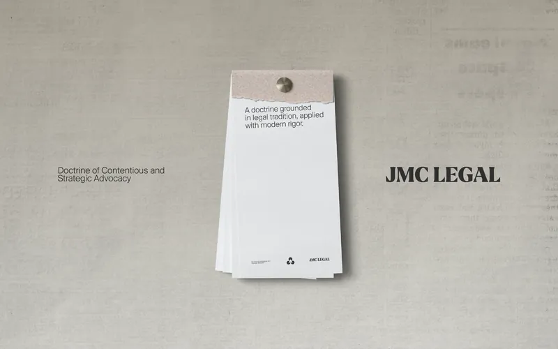
JMC Legal positioning and print collateral
Brand positioning and print collateral for a law firm in Prishtina, 2026: nine practice areas under one mark.
Dahinden Architect identity system
An identity system for an architecture practice in Switzerland, delivered in 2025 with a printed portfolio.
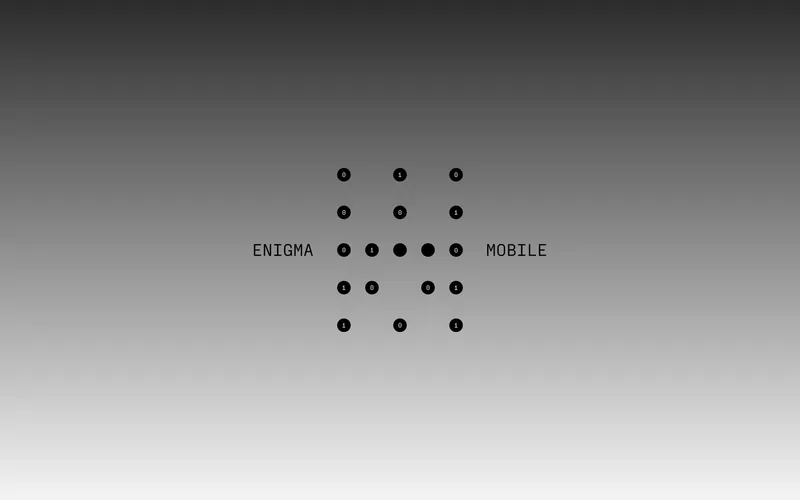
ENIGMA Mobile brand strategy and identity
Brand strategy and identity for a mobile telephony company, delivered in six weeks in 2024.
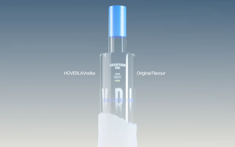
HOVERLA Vodka packaging and identity
Packaging and visual identity for a Ukrainian craft vodka, 2019.


The other two layers
A brand system rarely stays on paper. When it has to turn, light or move, it continues in the next layer; when it has to run as a website or an app, it continues in the structure underneath.
- 02 // SpaceSpatial interfacesA 3D product visualization studio and motion design studio in New York, with WebGL website development for work that has to turn, light and move in the browser.
- 03 // StructureSoftware architectureA Next.js development studio and creative technology studio. Web app design and development in New York, built to outlast the brief.
Open a brief
Tell us what you are making and what it has to hold. The studio reads every brief in full.